Why I built Memento, a mental inbox
The original idea for Memento had exactly one thing in common with its latest iteration: a widget. The original idea was an app called "Locket" where users send each other messages which appear on their home screen widget. I found out that this exact idea already existed with the exact same name, so I went back to the drawing board. But one thing stayed from that original idea, the idea of using a widget in place of a notification.
Why Widgets?
The pitfalls of notifications
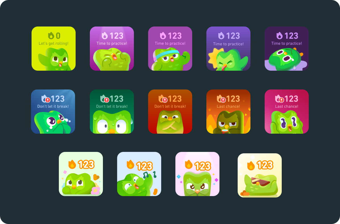
Notifications make a lot of sense for messages that the user needs to see at one specific time, but beyond that, they can be intrusive and annoying. The Duolingo notification, for instance, shows up at random times in the day, often being ignored simply because it shows up at a time where the user is preoccupied.
Reminders takes a different approach. On the day a reminder is due, only one notification is sent, but it lingers for the rest of the day until it is done. This is a step in the right direction, but the key benefits of notifications, urgency and spontaneity, are lost. The user gets used to the notification being there and eventually ignores it because it isn't new information.
Where widgets can excel
Widgets, on the other hand, are perfect for tasks with no specific time or due date as they are much less intrusive and pushy and can linger without overstaying their welcome, as lingering notifications often do.
When Duolingo got a widget, it benefitted greatly. Users now didn't have to get multiple daily interupting notifications, and could simply have one reminder widget sitting idly on their home screen that they see multiple times during the day.

Reminders also got a very helpful widget, showing users all their uncompleted reminders and allowing users to mark them as completed right from the widget.
The combination of widgets' passiveness and the ability to take action from them makes them the perfect choice for reminding users of saved ideas and links.
Iterating on the idea
After moving on from 'Locket', I rethought how I could use these strengths of widgets in a different way, and eventually thought of using them to resurface links the user saves so they can revisit them.
Adding Notes
At WWDC, I had so many incredibly interesting and thought-provoking conversations and wrote a lot of things down. This resulted in a bunch of notes in the notes app that were completely empty other than the title. It was clear that the Notes app wasn't made for these kinds of quick jots. This is why I added the capability for items first to contain notes added to links, and eventually added the ability to make an item with just a note and no link.
Expanding Scope
Although currently Memento only supports links and notes, I am working on adding support for photos, and am planning to eventually support any file uploads.
Thoughts on 'vision'
As I wrap up the initial version of Memento and move toward a phase mainly of bug fixes, pre-orders, and preparing for launch, I'm thinking about how crazy it is that only a few months ago, I was still scrambling to figure out in my head what the concept would be for the app.
I think the process of creating Memento has shown me how flawed and unrealistic the idea of the 'visionary' is. Ideas change and evolve and many times, they turn out completely different from the original idea, but they are almost always better for it, and someone who feels shackled to their original idea is almost always worse for it.
Right now, I have so many ideas for the app. So many of them have nothing to do with widgets or notes or links. I don't know if many of these ideas will ever make it into Memento, but I do know that I would be stupid if I didn't explore them out of obligation to an original vision.
But if I ever forget about these ideas or stop trying to explore them, I know I'll have a widget on my home screen to remind me.